Avec vous, nous affinons votre besoin, nous fixons les objectifs et nous imaginons la solution de formation
sur mesure qui permettra de développer les compétences visées.
Vos experts ont la connaissance. Nous savons comment interroger, reformuler, simplifier, scénariser, etc.,
quelle que soit la complexité du sujet à traiter. Nous rédigeons le contenu.
Ils ajustent. Et tout le projet gagne en efficacité.
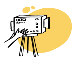
On tourne, on dessine, on designe, on enregistre, on développe…
Bref, on donne vie aux médias de votre formation,
toujours dans le respect du budget et des délais.
#Swisstouch